A Disaster Response Application

1. Introduction
During a calamity, the emergency response team is notified of the event only when someone in the affected area remembers to inform them. This introduces a small amount of delay in the response that the disaster response team can provide. The prototype application I built is intended to reduce this delay.
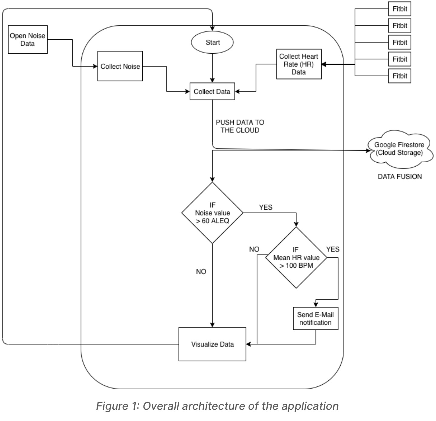
The idea involves a smart society wherein every citizen has a heart rate sensor on their body which would stream the wearer’s heart rate data in real-time to the disaster response application. The intention behind collecting heart rate values is that if a person perceives some form of danger, his/her heart rate will be very high. In addition, the noise levels around the city would be continually checked as well. If the noise level in an area is unusually high, then the average heart rate of all the citizens in that specific area is taken into account and if the heart rate value is also unusually high, then the disaster response team is notified about it immediately.
The current implementation of this prototype application is based on collecting live heart rate data from a Fitbit device (fitness tracker), emulating four other instances of heart rate data and comparing it with the noise data from a specific location (Navan Road, Dublin 7). The results of the comparison are used to decide if the application has to notify the disaster response team or not.
2. Data fusion and analysis of data
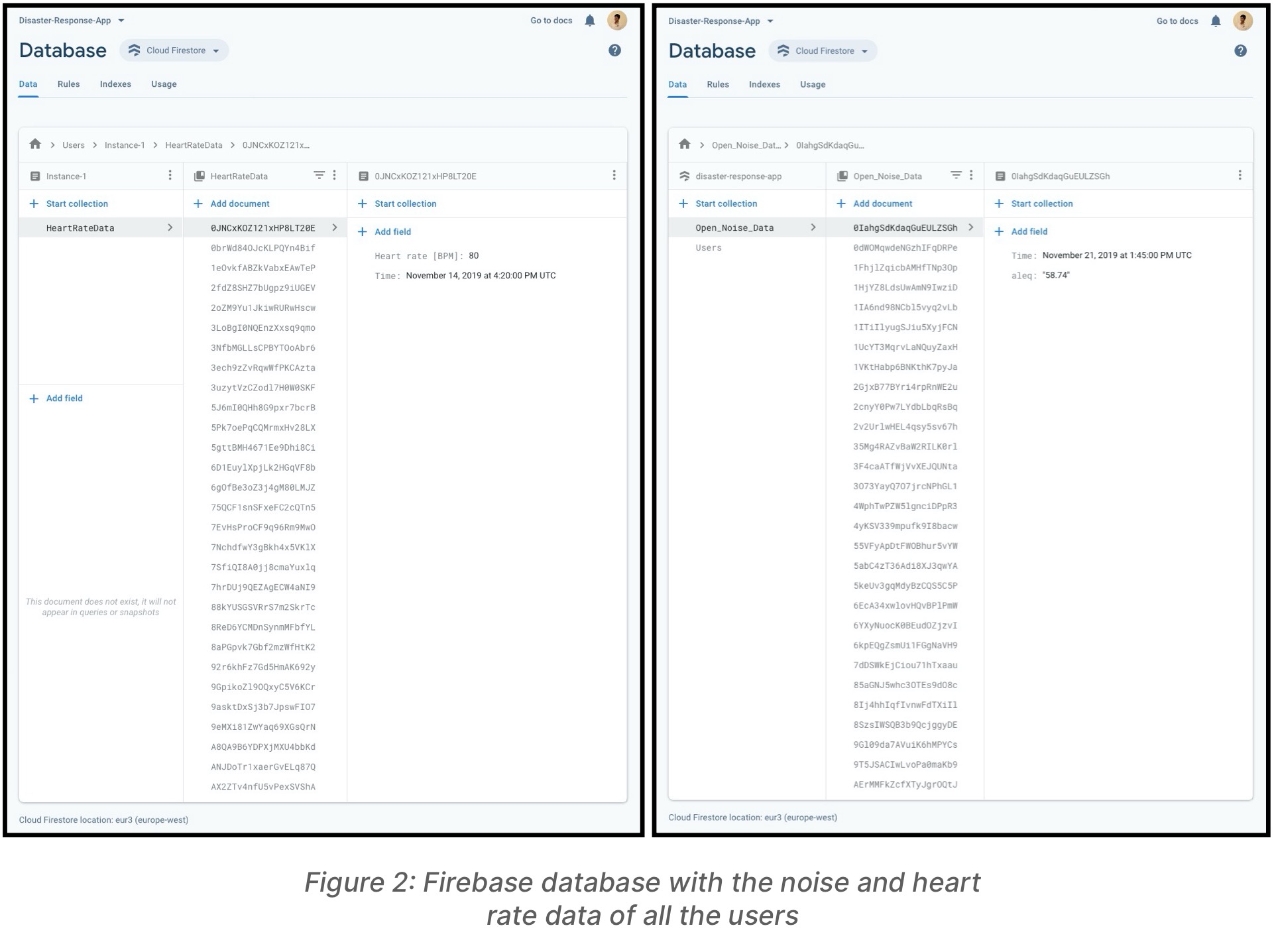
The heart rate data collected from Fitbit and the emulated sensor data of various other users are pushed to Firestore (Google Firebase Cloud Storage). The current noise data from the selected location is pushed to the same collection on Firestore too. As soon as the data fusion takes place on Firestore, the most recent noise value is checked. If the noise values are unusually high, then the mean of all the current heart rate values in the area is checked and an appropriate decision is made.
The open data source that supplies us with noise data in Dublin aggregates all the sensor readings it takes over a five-minute period. Hence the data points provided are of the format “10:00:00”, “10:05:00”, “10:10:00” and so on. Whereas, the heart rate data was collected at random intervals is in the order of seconds. Ideally, the Fitbit is capable of collecting the user’s heart rate every second but due to some external factors there exists a delay in computing the values by the device and thus the data is not available for every second. Hence, to solve this issue we manually aggregate the heart rate values within five-minute periods. The aggregation of data points was done using the ‘resample’ function that is available while using pandas dataframes in Python to store the values. So now, both the noise data and the heart rate data have equal time frames with which we can compare them.
Structuring the data model on Firestore to accommodate data fusion was a little tricky but the documentation was very clear and provided a neat example to setup sub-collections. The heart rate data from other sensor instantiations were emulated by generating CSVs using the website Mockaroo (https://mockaroo.com/ ) and converting them to pandas dataframes which could then be sent to Firestore.
3. Data visualization and actuation
3.1. Actuation
If the noise levels and the mean heart rate values in the area are higher than normal, then an actuation is triggered. The regular heart rate values for a person would be in the range of 60 – 100 BPM (Beats Per Minute), anything above this is considered too high by the application for mean heart rate value in a specific location. From my observations, the noise levels are usually in the range 45 – 60 ALEQ (A-weighted Equivalent Level). Thus, only when the noise and heart rate values exceed the above-mentioned values, the actuation is triggered.
3.2. Visualization
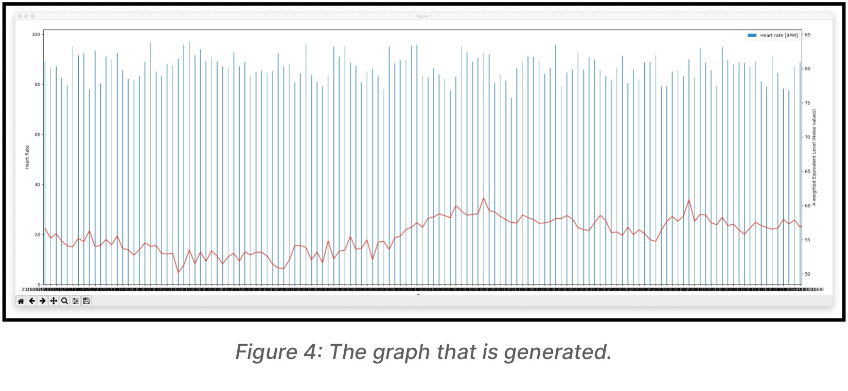
To visualize the data I believe a combination of a bar graph and line graph would be the best due to the nature of the values. Hence, the x-axis has the time-intervals, the left y-axis has the heart rate values and the right y-axis has the noise values represented as A- weighted Equivalent Level. The difference in colours between the two types of graphs makes it easy to visualize the graph easily. The visualization is triggered as soon as one of the two following things happen:
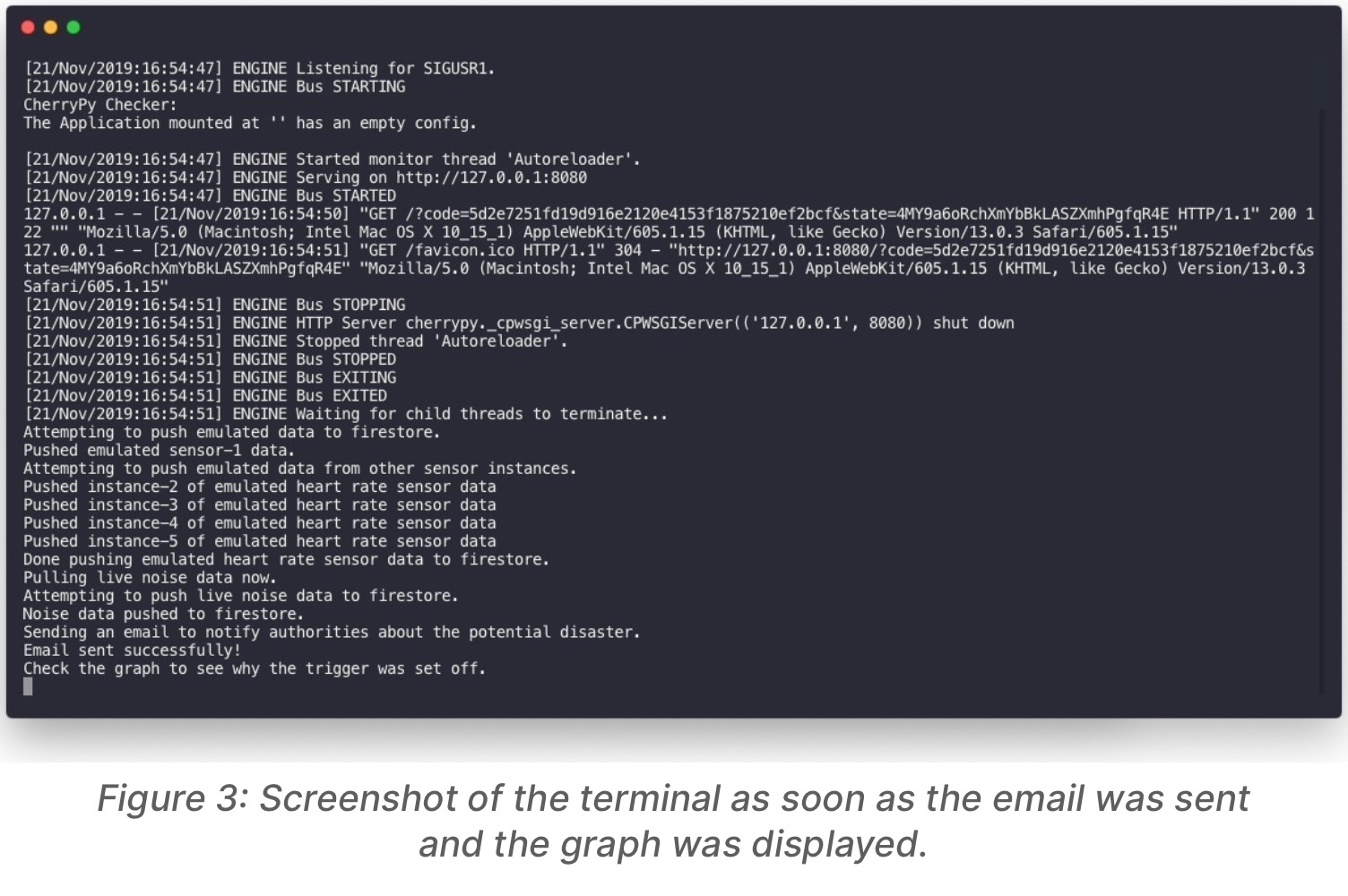
Both the noise and the heart rate are found to be unusually high, then the actuation is triggered and after the execution of the actuation, the graph is displayed so we can get a rough understanding as to why the actuation was triggered.
The noise level was unusually high, but the heart rate values were normal, then the actuation does not get triggered but for reference, the graph is displayed so we can get an understanding as to why no actuation was required even when noise values were unusually high.
3.3. Email
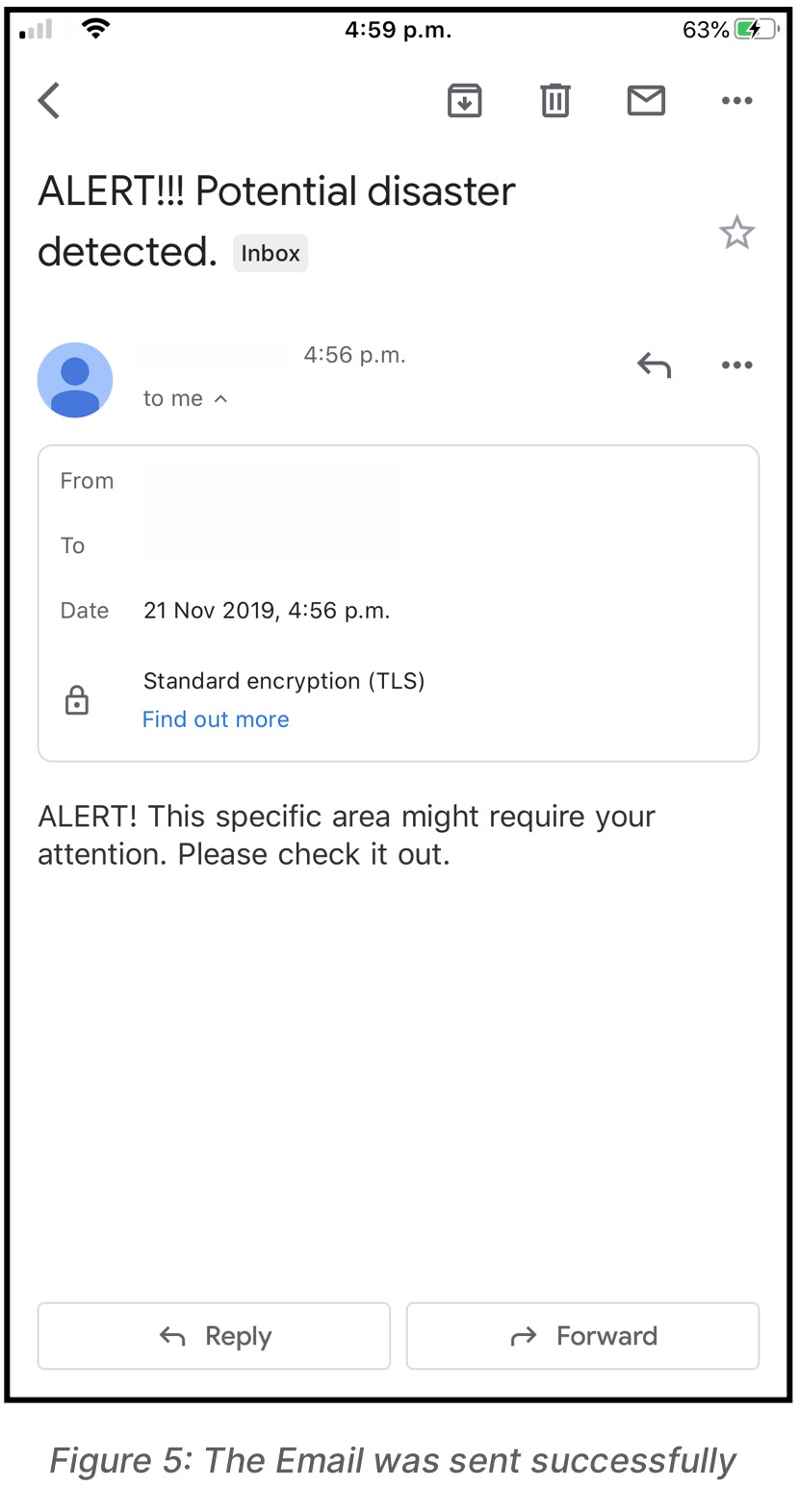
Instead of showing a simple message on the terminal that reads “Your attention is required as there might be a possibility of some calamity.”, it made sense to build an E-Mail notification system. Since everyone has E-Mail notifications set up on their smartphones, this would mean all the concerned authorities would be notified about the potential disaster immediately. The authorities can then decide which exact teams should be notified about the potential disaster or they can check the area out themselves.
4. Conclusion
In conclusion, the application that was built helps establish a platform for future work in this domain of disaster response during emergencies. The application considers the heart rate data of citizens in an area and noise values of the area to determine if the appropriate authorities need to be notified about a potential disaster or not. Other factors could be added to the application in the future to make the application more robust and suitable to be deployed in a smart society.
The contents of this post were originally written for a project report that I had to turn in as part of my assessment for the Urban Computing module at Trinity College Dublin.
